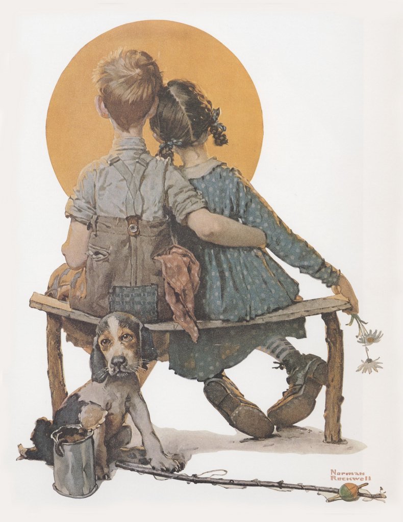
ADULT CONTENT IN A CHILD-LIKE PACKAGE


For most of the 20th century, the primary gripe against illustration was its simple-minded content. No matter how talented or skillful the artist, illustrations for silly romantic fiction in women's magazines or childish advertising slogans just could not be taken seriously.

How odd, then, that in recent years this situation has completely reversed: we have changed from sophisticated illustrations of cartoonish subjects to cartoonish illustrations of sophisticated subjects. Illustrators now deal with the most adult and graphic content, but do so using simple, child-like forms.
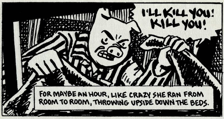

Art Spiegelman's crudely drawn comics of talking mice confronting torture and genocide in Nazi death camps won Spiegelman a pulitzer prize.


Child-like pictures by Debbie Drechsler convey blood curdling stories of incest and molestation.
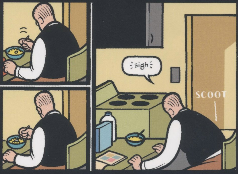


Chris Ware portrays bleakness and alienation using simplistic diagrams reminiscent of industrial instruction manuals.

This trend is evident from the changing mix of artwork in the annuals of the Society of Illustrators. It can also be seen in the work of the "new illustrators" group, the "concept art" crowd and the innovators behind "Raw." What is happening here? Why have form and content switched places in modern illustration? And what does that say about the evolution of our society?

I suspect that there are multiple forces at work. Clearly, illustration lost much of its ambition for technical skill as it fled from the path of the camera. There was not much point in investing years of rigor and discipline to develop skills if illustrators (and the publications that sustained them) were destined to lose the battle to television and photography anyway.

It also seems pretty clear that many of today's innovators didn't want to compete on the home turf of the great illustrators who preceded them. Seymour Chwast confessed that he stays away from techniques and media “that require craftsmanship and a drawing ability I do not have.” Elwood Smith, another highly regarded "cartoon-style" illustrator, recounts that when he tried to draw like the twentieth century “old master” artists with pen and ink, he simply couldn’t do it. But, he says, his inability to render the picture in his mind leads to greater innovation: “if I can’t draw it, I struggle to come up with a different idea that’s invariably more original.” The same could be said of a number of other contemporary illustrators who have shifted the direction of modern illustration.


But there are other, more legitimate reasons for the transformation to child-like styles. Recently, it seems that audiences and creators have become so saturated with mature content that they have become virtually shock proof. It is hard to envision a single vice that has not received ample, repeated and graphic airing. Perhaps for that reason, artists reach for simple, child-like images to reach audiences at a more susceptible and vulnerable level.

The great Mark Twain found that he could create a fresh perspective on adult corruption, greed and slavery by describing them through the eyes of an innocent young boy, Huckleberry Finn. Ever since then, artists have made creative use of the contrast between adult and child-like in various combinations. In the 1950s, Charles Schulz revolutionized the comic strip by putting adult wisdom in the mouths of simply drawn little children. Mel Lazarus used a similar approach with the beautifully drawn Miss Peach.

One interesting example of this trend is the use of a simple and innocent 1950s visual style from Disney animated movies and Golden Books to convey a more wicked subject matter. This juxtaposition of form and content can evoke surprising reactions. One of the very best at this is Shane Glines, a creative and prolific young artist with an excellent design sense.


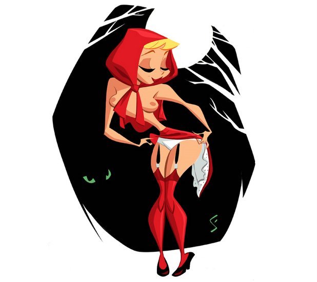
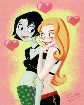


Another such artist is Dean Yeagle. These two, along with other illustrators, seem to be mixing spicy content with innocent images in creative ways. I enjoy their work.

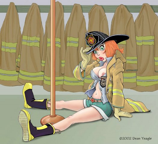
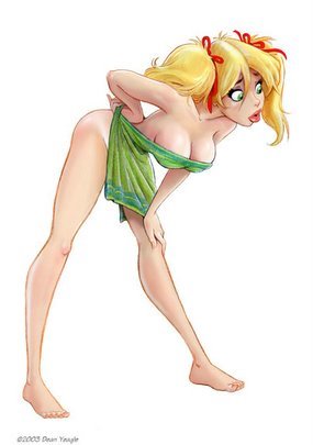


There is of course a larger issue that I have not addressed yet: why do illustrations with mature content but mediocre drawing merit museum shows, laudatory reviews in the New Yorker and pulitzer prizes, while illustrations with simplistic content and superb drawing are chronically snubbed? For example, comic strips like Flash Gordon by Alex Raymond (which had brilliant drawings of goofy stories) will never be accorded the respect that comic strips like Maus or Jimmy Corrigan (which have unimpressive drawings of serious stories) receive. As you might imagine, I have some thoughts on this too, but I have blathered on far too long for one day.

STEINBERG AT PLAY


© The Saul Steinberg Foundation/Artists Rights Society (ARS), NY

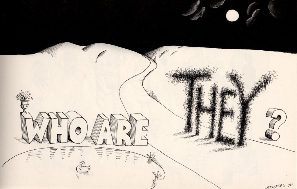
In the whole long clanging pageant of art, no artist ever combined words and pictures the way that Saul Steinberg did. He was truly an original. When Steinberg died, art critic Robert Hughes wrote, "He had no equals. Now he has no successors." The critic and philosopher Harold Rosenberg noted with admiration,"there is only one of his kind."


© The Saul Steinberg Foundation/Artists Rights Society (ARS), NY

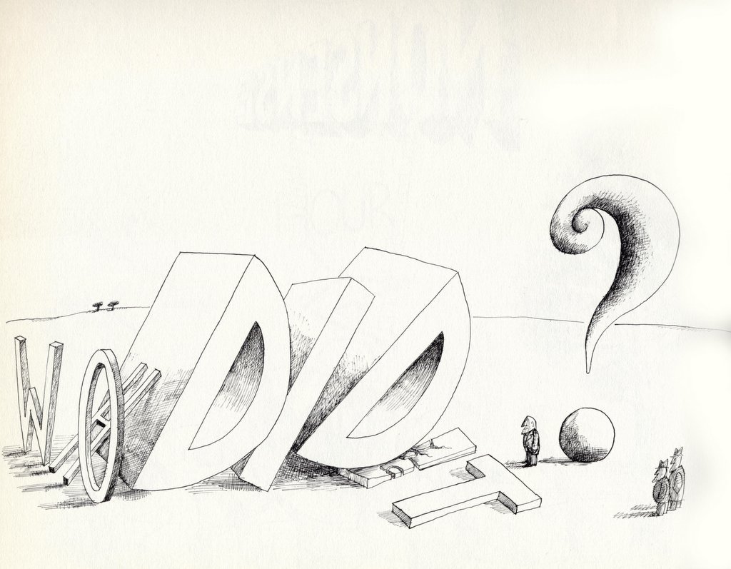
Steinberg dealt with the most immense and challenging issues of the human condition. New York Times art critic John Canaday wrote, "Steinberg is the great artist of the post World War II quarter-century and maybe, for all we know now, the whole latter half-century." But for all his depth and brilliance, Steinberg had a playful side that showed itself in simple little word pictures like these.


© The Saul Steinberg Foundation/Artists Rights Society (ARS), NY

These drawings reveal Steinberg's imagination at the granular level. He was quite capable of constructing elaborate, multi-tiered works of great profundity, but unlike today's image-conscious artists who work with press agents to shape their image and protect the mystery of their creativity, Steinberg was never afraid to put these little drawings on display. To borrow a phrase from Issac Stern, these drawings "make it so simple that you can't cheat."

I admire Steinberg as much for his backbone as for his clear artistic gifts. He was never afraid that his playful cartoons would dilute the brand of his museum paintings and sculpture.


© The Saul Steinberg Foundation/Artists Rights Society (ARS), NY

I have used this blog to disparage "concept artists" who delude themselves that the high falutin' content of their message will redeem their otherwise meager artistic talents. Steinberg is one artist who got it right-- brilliant content married to a strong and excellent visual form.


© The Saul Steinberg Foundation/Artists Rights Society (ARS), NY

ONE LOVELY DRAWING part four


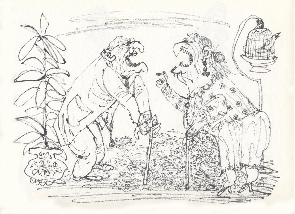
For thirty years, William Steig did yeoman work drawing competent drawings of mildly amusing domestic scenes. He supported his family through the Great Depression making pleasant cartoons for the New Yorker. I was never impressed with his work during this phase.

However, beneath the surface Steig idolized the drawings of Pablo Picasso. And beginning in the 1960s-- that great decade of cultural liberation-- Steig abandoned his old style and began drawing in a much wilder, more intuitive style. Gone were his discipline and control. Gone were the predictable domestic scenes. In their place came drawings of nymphs and satyrs penned in a child-like scrawl, Victorian ladies with immense bottoms, knights wrestling with butterflies and all kinds of fanciful subjects portrayed with rich, exciting pen work.


Posted by Picasa

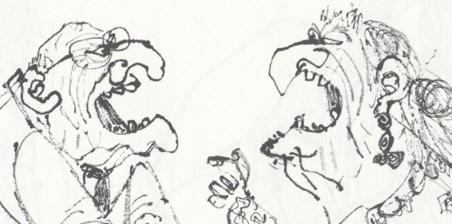
This drawing is a little unusual for Steig during the 1960s-- many of his drawings of the period were drawn in just a few carefully chosen lines. One of the things I really like about this drawing is that when the subject of a squabbling old couple called for frenzied chicken scratching, Steig had the range and courage to do it.

ONE LOVELY DRAWING, part three


© The Saul Steinberg Foundation/Artists Rights Society (ARS), NY

Saul Steinberg was one of the greatest illustrators of all time. He was so damn smart you could warm your hands by the intellectual glow from his drawings. Yet, his brilliant content never overpowered his images. Art critic Robert Hughes wrote that Steinberg exhibited a form of "graphic intelligence that had not been imagined in American illustration before him."

This lovely drawing is not one of his more famous or elaborate images, but I selected it because it shows very simply how Steinberg's mind provides fresh insight into the most elemental ingredients of our world: as he scans the horizon line, he plays with the fact that water makes straight things crooked, then uses that to make crooked things straight (the evergreen, the lightning bolt) and ends with the coup de grace: the straight flag pole is now corrugated but the waving flag has become straightened!

Steinberg's art could never be contained by words or images alone. He really required the marriage of the two. He was perhaps the 20th century's leading example of illustration as an irreducible art form.

ONE LOVELY DRAWING, part two


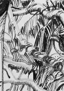
This jewel of a drawing by the great Robert Fawcett was a spot illustration for the story Mutiny in Paradise which appeared in This Week magazine in May 1957.

The original magazine was printed on cheap pulp paper, and most copies have long since crumbled into silt. I am posting a scan of the original so that this fine, arrogant drawing will continue to get the audience it deserves. Contrast Fawcett's use of drybush to convey the depth of the jungle outside the hut with the slashing brush strokes of the wall which energize the whole drawing.


Fawcett understood anatomy so well that he was able to depict the feet of the character with speed and confidence, despite their odd angle.


Most important, note how the subject matter was subordinated to the abstract design of the picture. Fawcett always said that the longer an artist could work on a representational drawing at the purely abstract level, the better.

ONE LOVELY DRAWING


While it is great fun to talk about the larger landscape of art, sometimes you can see more by looking through a microscope than by looking out the window of an airplane.

That's especially true when you are talking about the intimate art of drawing. As I have noted elsewhere, I think art critic Roberta Smith got it exactly right when she wrote about the special quality of drawing:


Drawings are the most overtly delectable of all art forms...Drawings in general are like love letters. Personal in touch and feelng, physically delicate, they reflect the artist's gifts, goals and influences in the most intimate terms... [They are] a direct extension of an artists's signature and very nervous system.
So I think it makes sense to take time out from bloviating about the art world to reflect on an individual drawing. I will be doing this on a regular basis, to bring attention to selected examples of long forgotten treasure and to give my detractors a better understanding of what I mean when I write about the great potential of drawing.


The illustrator Austin Briggs was featured this week in Leif Peng's excellent Today's Inspiration blog (http://todaysinspiration.blogspot.com/) which I heartily recommend to you. I am posting here a drawing by Briggs which has hung outside my bedroom door for ten years. This drawing of a World War II monument in Paris was executed with a dull crayon, yet it conveys astonishing subtlety and sensitivity. The virtuoso Briggs could've threaded a needle while wearing boxing gloves.


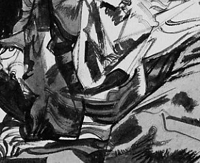
Notice in the detail above how Briggs has captured the man's stooped posture, his raised shoulder encircling his companion, his neck projecting from his collar, the bald crown of his head, and how efectively the simple indication of an ear conveys the man's reverse profile. With a crude tool and a primitive line, Briggs conveys more wisdom and insight about his subject than a thousand other artists might have conveyed using modern, precise tools and the most labored approach. Now that's drawing!


The statue, too, is rendered in a marvelous, vigorous way. Using nothing but talent and the simplest of tools-- a single black stick of wax-- Briggs created a symphonic range of effects to convey great power: shading, smearing, applying different pressure for different values, all applied with a confidence that reinforces the power of his subject. I hung this simple drawing outside my door ten years ago and I still learn something new from it almost every day.

THE BATTLE BETWEEN GOOD TASTE AND GOOD ART


When the illustrator Robert Fawcett decided to abandon fine art for illustration, His painter friends objected that illustration was coarse, vulgar and tasteless. Fawcett responded that "good taste" is often the enemy of creativity:

the creative act in art involves a kind of courage which good taste might easily modify. It almost seems as if the creative impulse involves a large ingredient of vulgarity to be a vital statement. In drawing, an excess of what we think of as good taste can only result in an anemic product, while the more vulgar statement... is invariably stimulating.

Pulitzer prize winner Michael Chabon sided with Fawcett, praising comic art as straddling
"high art and low art [at] the margins of trash and quality....There's something stimulating about hanging out at the borders there."

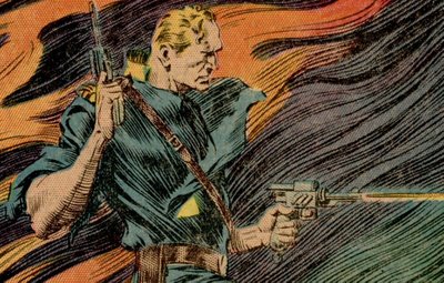
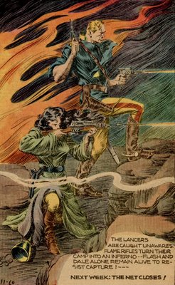
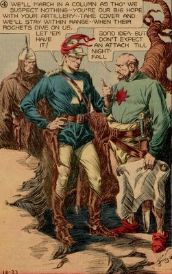
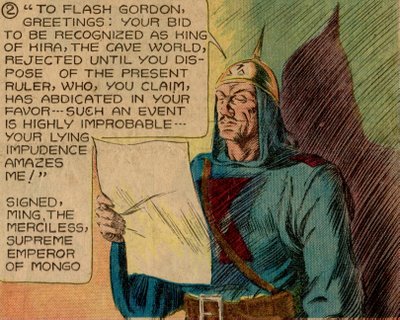
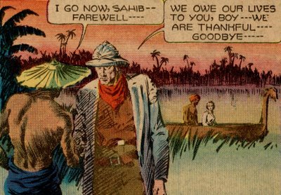
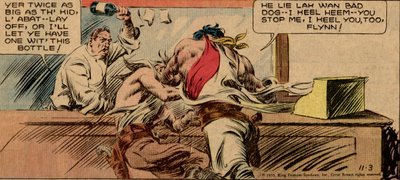
One of the most marvelous inventions to spring from the borders of trash and quality was Alex Raymond's comic strip, Flash Gordon. These virile drawings with their gorgeous lurid coloring are from a Sunday page in 1935.


Unfortunately, vulgarity has few defenders left these days. The priests of high art have learned to tolerate many forms of marginal art but have never quite overcome their aversion to rocket ships and ray guns. Even illustrators who should know better often pull up the ladder behind them once they achieve some legitimacy. When Edward Sorel, a caricaturist of modest skill, had a show at the National Portrait Gallery he quickly changed uniforms. I asked his opinion of his fellow caricaturists at MAD magazine and he sniffed with derision, "those people are vulgar."

Once upon a time, vulgar (meaning uncouth and unrefined) art was not such a problem. The greatest works of western culture were filled with slapstick humor, violence and sex. Homer, Chaucer and Shakespeare are riddled with vulgarity. Chaucer, for example, loved flatulence jokes more than Howard Stern does. Here he writes about how a woman, after cheating on her husband with one lover, sticks her naked bottom out a window to trick a second suitor who is standing outside begging for a kiss in the night:

Dark was the night as pitch, aye dark as coal
And through the window she put out her hole...
With his mouth he kissed her naked arse
Right greedily, before he knew of this.
Aback he leapt-- it seemed somehow amiss,
For well he knew a woman has no beard...
And said, "Oh fie, alas! What did I do?"

Compared to Chaucer, Flash Gordon seems positively refined. I don't recall Dale Arden resorting to anything so uncouth. Yet, pale critics weighed down by too much history and too much taste look at the excess in Flash Gordon and recoil.


Vulgar art flourishes even without defenders for the best of all possible reasons: because its strength commands an audience. It is robust art in a great cultural tradition. Some of the best ideas come from just outside the borders of good taste, wearing a little too much rouge, and we should not be so quick to take offense .