PAINTING WATER: THE MARRIAGE OF FREEDOM AND CONTROL


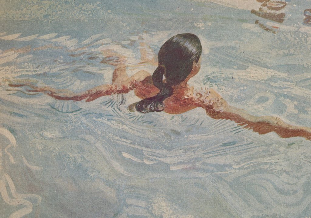
Sometimes it takes the greatest amount of self-discipline to capture the things that are most free and elusive. You might think that painting water-- that most fluid, shimmering substance-- would permit an illustrator to indulge in the wildest excesses. But I was surprised to discover that some of the painters who are best at capturing the freedom of water can only do so using the most exacting self-discipline and control. (There's probably a metaphor for life in there somewhere.)
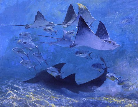


Stanley Meltzoff, whose spectacular paintings are featured in this and my previous post, described to me a similar process for painting water:

So far as I can tell depicting water depends on following the complex rules of illumination, refraction, reflection, color absorption, distortions of all these by the shape of the waves and the color of the bottom and supended particles, all in perspective. There are now computer dependent rules for depicting water in different wave shapes and lighting used by animators in making special effects. The instructions in computer language are beyond my understanding, but available. The How To books in art stores have simpler sets of instructions for painting water which, even if incomplete, are illuminating. So are the comments of John Ruskin in Stones of Venice, and even Gombrich in Art and Illusion. Current water painters do better analysing photographs and reconstructing the fluids in accord with the rules for making illusion, once they have spent some time looking at that particular structure of fluids in motion. I suppose mystics can do this by prayer or meditation, but the picture makers I am acquainted with are practical craftsmen, among whom there are some who can tell a story better than others. I suppose Moses could make water flow from a rock, but Meltzoff needs to use paint on gesso panels to create the illusion of water and wetness for others to contemplate.


Meltzoff went on to talk about the differences between capturing the world above water and the world underwater:

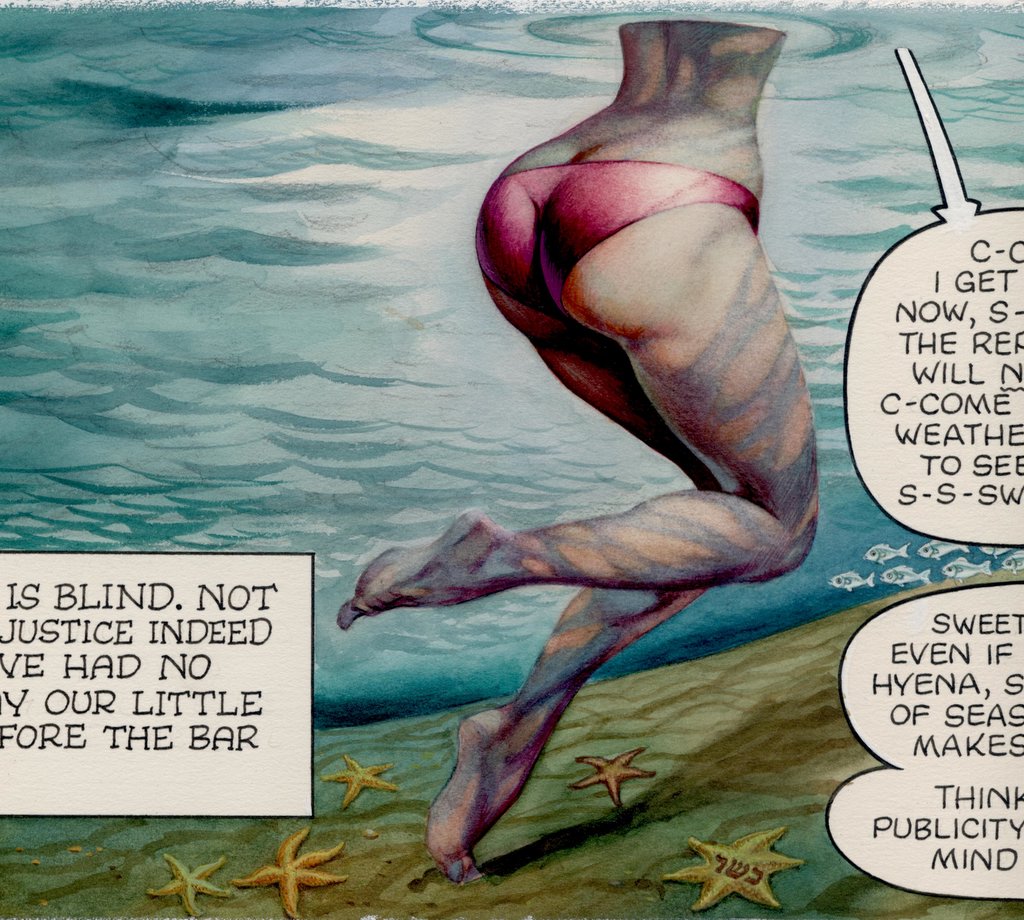
Let me say that painting underwater light and space involve more and other optical rules than water seen from above. The source of light is from above through the water surface. It is as if the waves seen from above were emiting light from beneath . The undersurface reflects in more complex ways than the surface above. Moreover the light is not in a continuous flow as in daylight, but is in distinct bands of focused light surrounded by large volumes of diminished and unfocussed light, in motion and overlapping. Atmospheric perspective and color absorption are more varied and affect varying wave lengths according to the optical processes and physics of water rather than those in air. The movement of bands of light underwater is quite unlike anything above water. With the exception of the undersurface and the bottom when visible, the rules of vanishing point perspective in air are useless underwater, except for single objects. It is not at all like painting en plein air. The same is true for the effect of gravity on vertical and horizontal structures which is so marked above water and clearly seen in vanishing point perspective.
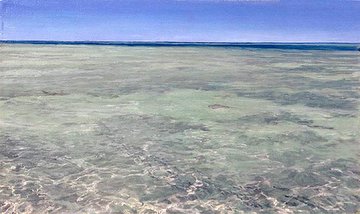


Reflecting on Meltzoff's approach, I was struck by how hard he works to convey an evanescent, shimmering freedom and how successful he is at doing so. It shows how much you can achieve at the intersection where freedom and control come together. As the author Rabindranath Tagore wrote long ago:

The freedom of the storm and the bondage of the roots
join hands in the dance of swaying branches.
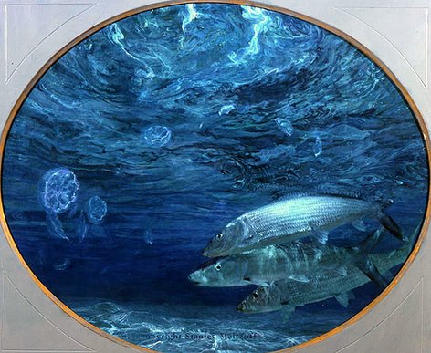
Unless you have both the storm and the roots, there just ain't no dancing.

WATER


Water has always presented a special challenge for artists. It has no consistent shape or color. It does not reflect light or cast shadows the way solid objects do. In the picture above of a shipwreck and the following picture of a placid river, illustrator N.C. Wyeth captures two very different examples of water's temperament.


Water refuses to hold still like a bowl of fruit on a table in your art studio, so painters have gone to extraordinary lengths to observe it. J.M.W. Turner famously lashed himself to the mast of a ship in a storm at sea so he could experience the power of water. Renowned illustrator and maritime painter Stanley Meltzoff is a long time diver. Meltzoff's immersion in his subject pays off in vivid, exciting paintings. Note the marvelous abstract design in the interplay of light and water at the top of the picture:


Illustrators over the years have employed a fascinating variety of approaches to water. For some artists, water seems to serve as rorschach test. They have to reach deep into their own personal taste and style to create form and shape and content for water. In the following picture illustrator Robert Fawcett (who was a first rate draftsman but unfortunately color blind and a second rate painter) tries to capture water by painting it as if it were a line drawing:


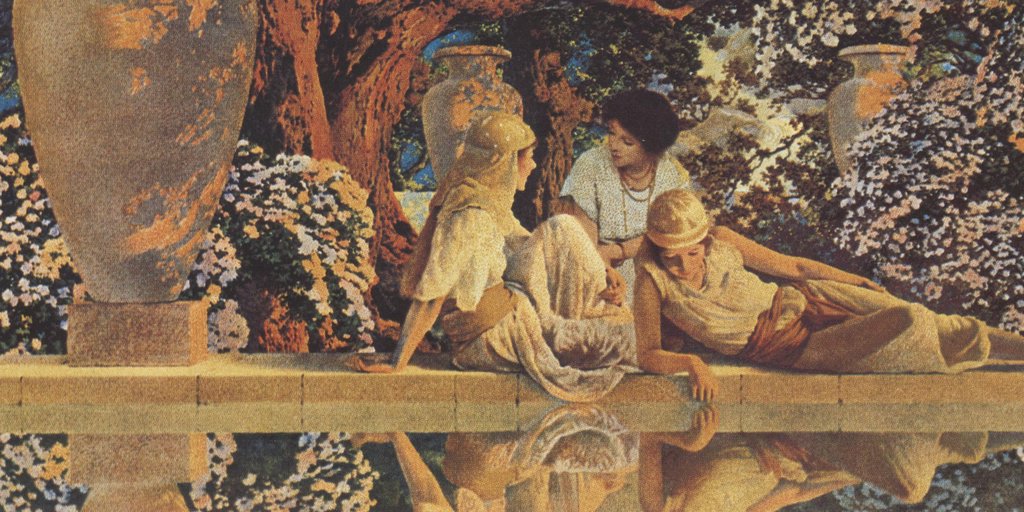
When Maxfield Parrish wanted to paint water, he often used a mirror for reference, rather than studying real water. The result was a picture of water as artificial as Parrish's candied, fantasy style:


Of course, Frank Frazetta painted water using his own trademarked formula:


Strikingly different methods of depicting water have also been adopted by animators (ranging from Pinocchio and Fantasia to the Incredibles) and by Japanese woodblock artists such as Hokusai. I would be interested in input from readers on additional artists and approaches.

In my view, the most impressive maritime paintings today are being produced by Meltzoff:


I recently read Meltzoff's views on the creation of art underwater. He wrote
Underwater it is somewhat as if Tiepolo were doing free floating and flying mythologies in the water instead of in the air and illuminated them with focused sheets and bands of strobe lights. That is what makes it so interesting for me to dive.
I will devote my next posting to some of Meltzoff's insights.

ONE LOVELY DRAWING, part seven


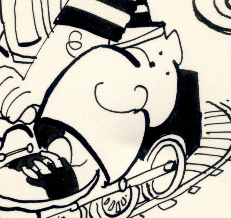
This drawing by Hank Ketcham dates back to the era before comic strips were drawn with the monotonous line of a felt tip marker and reproduced at the size of a postage stamp. Looking at this original drawing, you can feel the bite of Ketcham's pen nib on paper. You can see how Ketcham expertly guided the flow of the ink around the page like a master hydrologist. The energy and variety of Ketcham's line create a joyful little design at the same time that it conveys a wealth of information about his subject.


By the time this drawing appeared, Ketcham had been drawing Dennis the Menace for over 35 years. His creation had become a big business, and the weary Ketcham often resorted to ghost artists to draw his panels. Yet, when Ketcham picked up the pen here, he still took obvious pleasure in drawing the folds in the pants or the squiggle of the child's elbow. This drawing may have taken Ketcham only minutes to execute, but it took decades to be able to draw it.

NO STRAIGHT THING


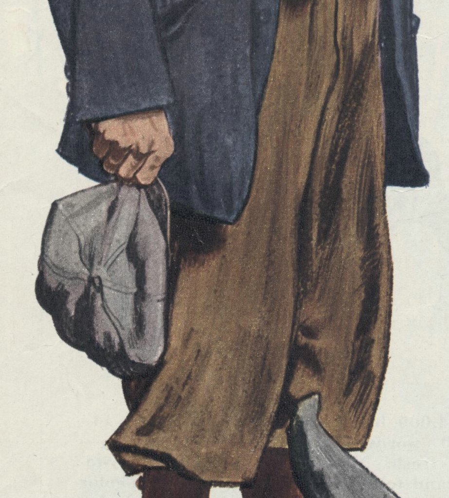
The illustrator Robert Fawcett used to complain about the grueling training in figure drawing that he received at the Slade school in London. He recalled bitterly how one professor made him devote a full week to drawing a single figure on plain paper using a hard graphite pencil. While it seemed like torture at the time, Fawcett admitted that by forcing him to focus on every nuance of the drawing, his professor weaned him from "the long, long search for shortcuts."

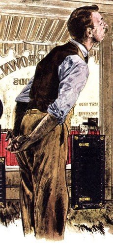
This training shows up in many of Fawcett's illustrations, where he rarely resorted to the popular shortcuts in rendering the human figure. He did not assume that figures stood at a right angle to the ground, or that they were symmetrical.


You rarely see straight lines for pants legs or ovals for heads. If you look at the shoulders, posture and body frames in these examples, you will see the work of an artist who kept his eyes open.


The great philosopher Immanuel Kant once observed, "Out of the crooked timber of humanity, no straight thing was ever built." Fawcett seemed to appreciate that, and took great delight in illustrating the knot holes, wood grain and corrugated bark of his subjects.

ONE LOVELY DRAWING, part six


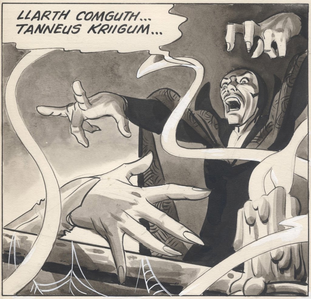
The Spiderman movies made $1.6 billion even before the toy distribution licenses. But if you strip away the investment bankers, lawyers, production companies and talent scouts, the whole mighty empire began with one lone guy sitting at his drawing board late at night drawing pictures while moths flickered around his fluorescent light.

That guy was Steve Ditko. When you look at his original drawings, such as the one above, you can appreciate how rich and evocative they were. Even when muted by cheap printing on pulp paper, even without computer graphics, explosions in dolby sound and flashing lights on a big screen, they were able to capture the imagination and loyalty of young boys. Ditko's battered drawing board is where it all started, the chain of events that went on to make hundreds of people fabulously wealthy (but not, of course, Steve Ditko).

Ditko reminds me of the ancient Egyptian temple of Karnak.


The Egyptians built that massive temple over a 2,000 year period. The temple grounds cover 200 acres of buildings, sacred lakes and grand courtyards. Karnak's Sacred Enclosure of Amon alone is 61 acres and would hold ten European cathedrals.

But at the very heart of this sprawling temple compound is the Naos, the small primeval mound where ancient people first gathered to worship long before the engineers, builders and armies showed up. A handful of people found religious inspiration from that site, never dreaming that a mighty empire would arise from where they stood. If you are impressed by the wealth and power of Karnak's concentric circles of vast courtyards and massive columns, it is good to remember that they all grew from a small sacred spot at the inner most core of the temple-- the "Holy of Holies."

The place where the original artist's brush touched the paper, that is the holy of holies.

ONE LOVELY DRAWING, part five


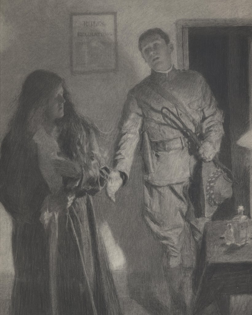
Paging through Victorian era magazines you will find thousands of dull, unimaginative illustrations that long ago ceased to have relevance to anyone. But every once in a while you find an illustration that leaps off the page, grabs you by the lapels and shakes you. The rare artist with "the spark" still stands out.

Most of his peers have been blissfully forgotten, but English illustrator William Hatherell (1855-1928) had "the spark" and deserves to be remembered for it.

This drawing overcomes every disadvantage that the world could throw in its way: working in black and white with charcoal and wash, reproduced in a publication with poor printing quality in a period when the prevailing style was largely fusty and stolid, Hatherell produced a picture of striking strength and vitality measured by the most modern standards.

His composition has all the verve and excitement of an illustration from America in the 1960s. His potent use of values, his vigorous strokes and the careful placement of figures result in a picture more dynamic and lively than much of what is produced today using the latest computer graphic technology. It just goes to show you that even if you are born in the wrong place and time, working with the wrong tools, sheer talent can do a lot to level the playing field.

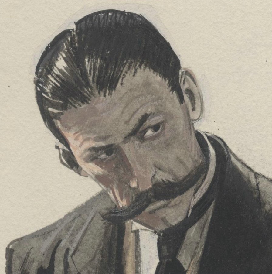
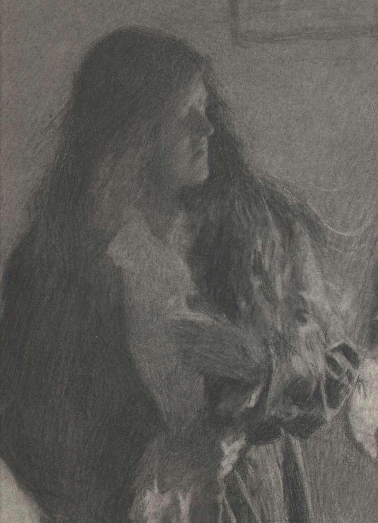
I don't have access to the original of this drawing by Hatherell, but I am attaching below some details from another one of his drawings so you can see his technique.


Hatherell worked on the staff of a magazine called The Graphic starting in the early 1890s.


In less capable hands, this drawing would lapse into a nondescript puddle of gray. Only Hatherell's mastery of value maintains the integrity of the picture.


You won't find much of his work around these days, but this was a man who could draw.

DAVID LOW: TAKING AN EXTRA DAY TO MAKE IT LOOK EASY


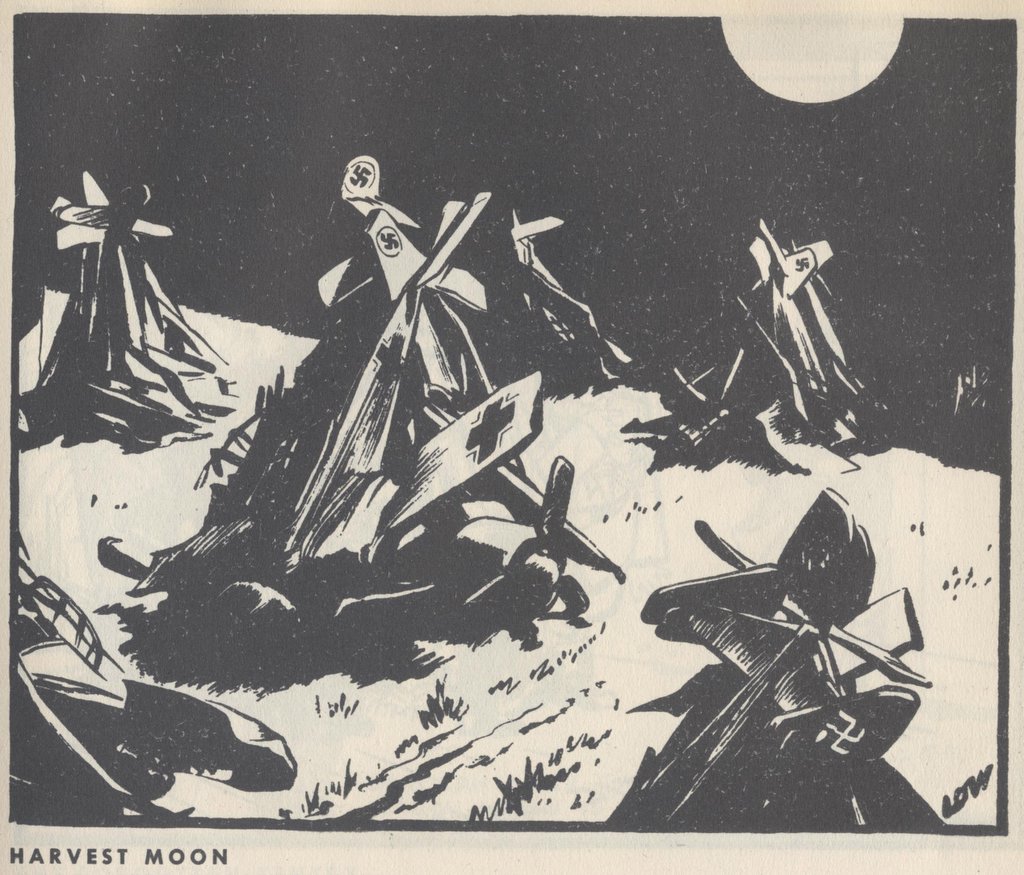
Perhaps the best political cartoonist to emerge from the smoking cauldron of World War II was David Low. The power of his simple, clear drawings took him halfway around the world and protected him from many forms of censorship.


Low was born in a small town in New Zealand in 1891. He learned to draw from studying the pictures in old magazines in the back of a second hand bookshop. The popular style when Low was growing up was fancy, elaborate linework the way Charles Dana Gibson, Charles Keene and Norman Lindsay drew. Low wanted a simpler, cleaner look. His goal was to combine "quality with apparent facility."


Low's direct, powerful style stood out from other editorial art of the day and brought him to the attention of local New Zealand publications, which then brought him offers of employment from Australia, and later from England where the richest and most powerful newspapers bid fiercely for his services. From this forum, Low waged a brilliant graphic assault on the Nazis.

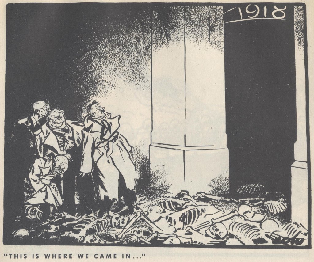
Low's art was not as simple as it looked. He later wrote, "making a cartoon occupied usually about three days: two spent in labour and one in removing the appearance of labour." You can see Low's hard work below the surface in the beautiful body language and facial expreessions of Stalin and Mussolini singing above, or in the salutations of Hitler and Stalin below. Note the tilt of the heads and the angles of the bodies. These are wonderfully choreographed drawings with simple, powerful darks and whites.


By studying the originals up close (see next image) you can see just how blunt and uncluttered Low's brushwork was. He worked large-- a typical cartoon would be 14 x 17.


I love Low's no-frills drawing. Its honesty and toughness stood up to many a powerful enemy. Low was an ardent socialist but he was so good that the staunchly conservative Lord Beaverbrook begged Low to come work for Beaverbrook's newspaper, The Evening Standard. Beaverbrook promised to double Low's salary and give him complete artistic freedom. Beaverbook later grumbled that Low was trying to comandeer the whole paper's editorial policy, but he never dared to censor Low's voice.


Hitler was enraged by Low's scathing drawings, and the Nazi government formally requested that the British government "bring influence to bear" to stop Low. However, nothing was done. After World War II, objections came from the opposite side of the fence: Winston Churchill claimed that a cartoon about the situation in Greece should be blocked "in the interests of western democracy."


Once upon a time, the ability to draw with strong, clear lines and a sharp eye could take you from a small town in New Zealand to the center of the world stage in London where powerful publishers and world leaders would rail against you, to no avail. Low was ultimately protected by the beauty and directness of his work.